Modes
Modes are alternate forms of a token that can be triggered to activate in different contexts. They allow your design system to account for different states or contexts that allow some values to change while others remain the same.
To explain this concept, we’ll explore 2 common usages: color and typography.
Examples
Example 1: Color modes
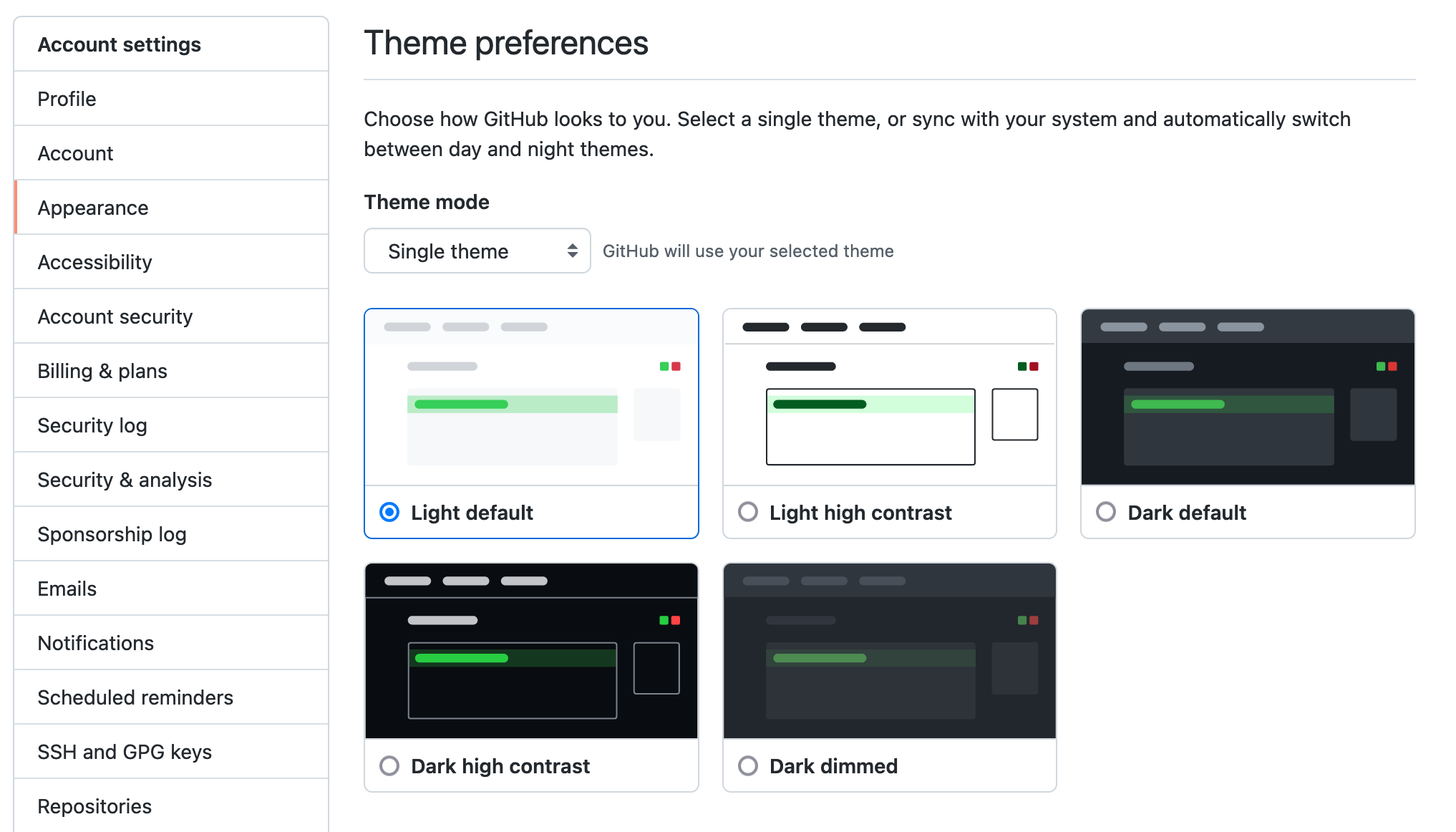
In this screenshot of GitHub’s dashboard you’ll find 5 color themes: Light default, Light high contrast, Dark default, Dark high contrast, and Dark dimmed (shown above). How might that be represented in tokens?
INFO
This is an older screenshot that is missing some of GitHub’s newer color modes, but the core idea hasn’t changed.
Without Modes
Consider the red and white colors in the system. Whereas red has a different value for each mode, white is an absolute value that doesn’t change. A (wrong) first attempt may look something like:
{
  "color": {
    "$type": "color",
    "red": { "$value": "#fa4549" },
    "red-light": { "$value": "#fa4549" },
    "red-lightHighContrast": { "$value": "#d5232c" },
    "red-dark": { "$value": "#f85149" },
    "red-darkHighContrast": { "$value": "#ff6a69" },
    "red-darkDimmed": { "$value": "#f47067" },
    "white": { "$value": "#ffffff" }
  }
}color:
$type: color
red:
$value: "#fa4549"
red-light:
$value: "#fa4549"
red-lightHighContrast:
$value: "#d5232c"
red-dark:
$value: "#f85149"
red-darkHighContrast:
$value: "#ff6a69"
red-darkDimmed:
$value: "#f47067"
white:
$value: "#ffffff"But off the bat we have some problems:
- Color themes are scattered between our original colors
- Token names now carry implicit context
- There’s not a clear abstraction of color themes
- It’s unclear when
[color]-[mode]exists, and when it doesn’t - Strict naming guidelines must be enforced for this to work long-term
- Updating/managing color modes can become a precarious game of find-and-replace
- What if
red-darkerwas added in the future—do we now havered-darker,red-darker-dark, andred-darker-light?
With Modes
Modes exist to solve these problems by decoupling token names from context and state. This is how it can be represented with modes (using the $extensions property from the token syntax):
{
  "color": {
    "$type": "color",
    "red": {
      "$value": "#fa4549",
      "$extensions": {
        "mode": {
          "light": "#fa4549",
          "lightHighContrast": "#d5232c",
          "dark": "#f85149",
          "darkHighContrast": "#ff6a69",
          "darkDimmed": "#f85149"
        }
      }
    }
  }
}color:
$type: color
red:
$value: "#fa4549"
$extensions:
mode:
light: "#fa4549"
lightHighContrast: "#d5232c"
dark: "#f85149"
darkHighContrast: "#c38000"
darkDimmed: "#f85149"Our tokens are vastly improved by having clear colors, and clear color modes. And color modes can be easily modified without affecting any names. Colors can optionally have mode variations, or not. And best of all, application-specific context isn’t affecting your token names.
This simplifies your application code, too, as, you can simply refer to color.red and the mode can be inferred based on the global context. below to see the “how”).
With @cobalt/plugin-css
If using @cobalt/plugin-css, you could generate CSS to handle these modes. That would look something like:
import pluginCSS from "@cobalt-ui/plugin-css";

/** @type {import("@cobalt-ui/core").Config} */
export default {
  tokens: "./tokens.json",
  outDir: "./tokens/",
  plugins: [
    pluginCSS({
      modeSelectors: [
        { mode: "light", selectors: ["@media (prefers-color-scheme: light)", 'body[data-color-mode="light"]'] },
        { mode: "lightHighContrast", selectors: ["@media (prefers-color-scheme: light) and (prefers-contrast: more)", 'body[data-color-mode="lightHighContrast"]'] },
        { mode: "dark", selectors: ["@media (prefers-color-scheme: dark)", 'body[data-color-mode="dark"]'] },
        { mode: "darkHighContrast", selectors: ["@media (prefers-color-scheme: dark) and (prefers-contrast: more)", 'body[data-color-mode="darkHighContrast"]'] },
        { mode: "darkDimmed", selectors: ['body[data-color-mode="darkDimmed"]'] },
      ],
    }),
  ],
};
Then in your CSS, the correct color mode would apply automatically in most instances, but you could also set <body data-color-mode="[mode]"> to override it. Also note there aren’t browser-global colorblind preferences, so if you added a colorblind color mode, it would have to be initialized manually (i.e. user preference).
Example 2: Text size modes
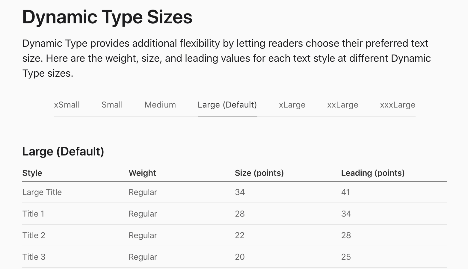
Apple’s dynamic text sizes use modes to control multiple type scales.
Without Modes
Another common example is text size. If users need to make the text bigger or smaller, they can adjust to their taste. But trying to have this context exist in the token names can result in pretty long values (note this is just ONE text size):
{
  "typography": {
    "size": {
      "title1-xSmall": { "$value": "25px" },
      "title1-Small": { "$value": "26px" },
      "title1-Medium": { "$value": "27px" },
      "title1-Large": { "$value": "28px" },
      "title1-xLarge": { "$value": "30px" },
      "title1-xxLarge": { "$value": "32px" },
      "title1-xxxLarge": { "$value": "32px" }
    }
  }
}typography:
size:
title1-xSmall:
$value: 25px
title1-Small:
$value: 26px
title1-Medium:
$value: 27px
title1-Large:
$value: 28px
title1-xLarge:
$value: 30px
title1-xxLarge:
$value: 32px
title1-xxxLarge:
$value: 32pxNaming a font size token as typography.size.title1-Medium or typography.size.title2-Medium is a bad idea, because then every level of your application must be aware of the user’s current preference settings. And if values ever change, now your entire application must be updated everywhere.
With Modes
Instead, by declaring font sizes as modes, the value becomes much more portable: typography.size.title1.
{
  "typography": {
    "size": {
      "title1": {
        "$name": "Title 1",
        "$type": "dimension",
        "$value": "28px",
        "$extensions": {
          "mode": {
            "xSmall": "25px",
            "Small": "26px",
            "Medium": "27px",
            "Large": "28px",
            "xLarge": "30px",
            "xxLarge": "32px",
            "xxxLarge": "32px"
          }
        }
      }
    }
  }
}typography:
size:
title1:
$name: Title 1
$type: dimension
$value: 28px
$extensions:
mode:
xSmall: 25px
Small: 26px
Medium: 27px
Large: 28px
xLarge: 30px
xxLarge: 32px
xxxLarge: 32pxNow the user preferences only have to be dealt with in the global context, and the rest of your code will adapt.
Additional Examples
To see how to use modes in specific languages, see the following plugin docs:
Best practices
A mode is best used for 2 variations that are never used together.
Back to the color example, if a user has requested high contrast colors, we’d never want to show them the default (non-high contrast) green; we’d want to preserve their preferences.
So following that, here are some common scenarios for when modes should—or shouldn’t—be used.
✅ Do
Do use modes for when a user can’t be in 2 contexts on the same page:
- User preferences (e.g. text size, reduced motion, colorblind mode)
- Device (e.g. mobile or desktop)
- Region/language
- Product/application area (e.g. marketing site vs dashboard UI)
❌ Don’t
Don’t use modes for things that can be used on the same page:
- Semantic color (e.g success or error)
- Localized state (e.g. disabled or active)
- Color shades/hues
- Components (e.g. card or button)
Advanced
Validation
WARNING
This is now deprecated; use the required-modes lint rules instead for more power and flexibility.
To enforce all modes exist for a group. You can assert typechecking with $extensions.requiredModes:
{
  "color": {
    "$extensions": {
      "requiredModes": ["light", "lightHighContrast", "dark", "darkHighContrast"]
    },
    "red": {
      "4": {
        "$type": "color",
        "$value": "#fa4549",
        "$extensions": {
          "mode": {
            "light": "#fa4549",
            "lightHighContrast": "#d5232c",
            "dark": "#f85149"
          }
        }
      }
    }
  }
}color:
$extensions:
requiredModes:
- light
- lightHighContrast
- dark
- darkHighContrast
red:
"4":
$type: color
$value: "#fa4549"
$extensions:
mode:
light: "#fa4549"
lightHighContrast: "#d5232c"
dark: "#f85149"In the above example, we’d have an error on color.red.4 because the darkHighContrast mode is missing. This helps ensure you’re not accidentally getting fallback values you intended to set.
requiredModes can be enforced at any level. And it will require all children to have every mode present (regardless of $type).